
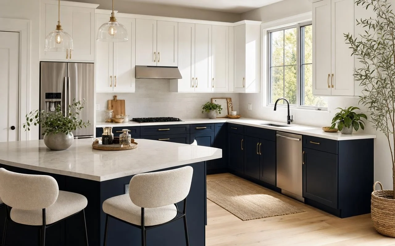
You are looking at your kitchen elements all in white and something feels off: it’s clean, yes, but a bit flat. In recent years, decorators have moved away from ultra-uniform kitchens toward two-tone kitchen cabinets, livelier and warmer. In the midst of this movement, one voice matters: Christina Haack, the HGTV star who has made the kitchen her favorite room.
Christina Haack emphasizes this point bluntly: “The kitchen is my favorite room in the house,” she told House Beautiful. “It’s the one that, in my view, most interests buyers. It’s really the heart of the home, and I think it’s generally the biggest transformation as well.” She even goes so far as to say that new kitchens “sell houses.” Studies cited by the magazine indicate that a kitchen renovation can recover up to about 60% of the invested amount, a major stake when planning a project. Her latest discovery around two-tone cabinets fits precisely within this logic.
The Christina Haack Rule: Two-Tone Kitchen Cabinets to Gain Depth
In an article published on August 7, 2025, House Digest details Christina Haack’s favorite trick for adding relief to a kitchen without overloading it with decoration. The principle is a simple rule: choose lighter upper cabinets and darker lower units. This vertical contrast immediately creates a sense of depth and a more “dimensional” appearance than uniform facades.
In one of her projects, the designer uses bright white upper cabinets paired with dark blue lower elements, almost stormy. The light hue near the ceiling naturally draws the eye upward, giving the impression of a more generous volume and a brighter space. The dark tone at the bottom acts as a visual base and anchor. The authors of House Digest note that this approach transforms a kitchen deemed too clinical into a space that feels richer and less sterile.
White on Top, Color on Bottom: the Duo That Expands the Kitchen
The white-on-top / color-on-bottom pairing remains the easiest to achieve for a non-professional. The white on the upper cabinets preserves all the light, even in a kitchen with limited exposure, while the deep blue on the lower elements adds character without darkening the room. The eye reads the top as light and airy, immediately lightening the perceived volume—even in a small galley kitchen.
The method works with other color pairings, as long as the principle of transitioning from light to dark is respected. One might imagine a very pale beige up top with a charcoal gray bottom, or a light gray paired with a deep green. The specialists questioned by kitchen sites remind that it’s best to pair a neutral base with a bold color, rather than two highly saturated tones that fatigue the eye.
Mixing Wood and Paint: The Trick for a Less Flat Kitchen
For those who love warm atmospheres, Christina Haack applies the same logic with materials. House Digest describes a variant where the lower cabinets are dark-stained wood while the upper cabinets are painted white. Wood adds texture, visible grain, and a bespoke feel, whereas the light paint on the upper portion maintains brightness and prevents the whole space from seeming too bulky.
A few reflexes help secure this two-tone choice, whether the kitchen is large or very compact, where this light-on-top / dark-on-bottom effect creates a real sense of grandeur:
- Keep the lower part in the darkest shade to serve as a visual anchor and base.
- Pair a neutral color (white, beige, light gray) with a more saturated hue rather than two garish tones.
- Ensure that the chosen colors coordinate with the countertop, backsplash, and floor to maintain a fluid reading of the room.
