
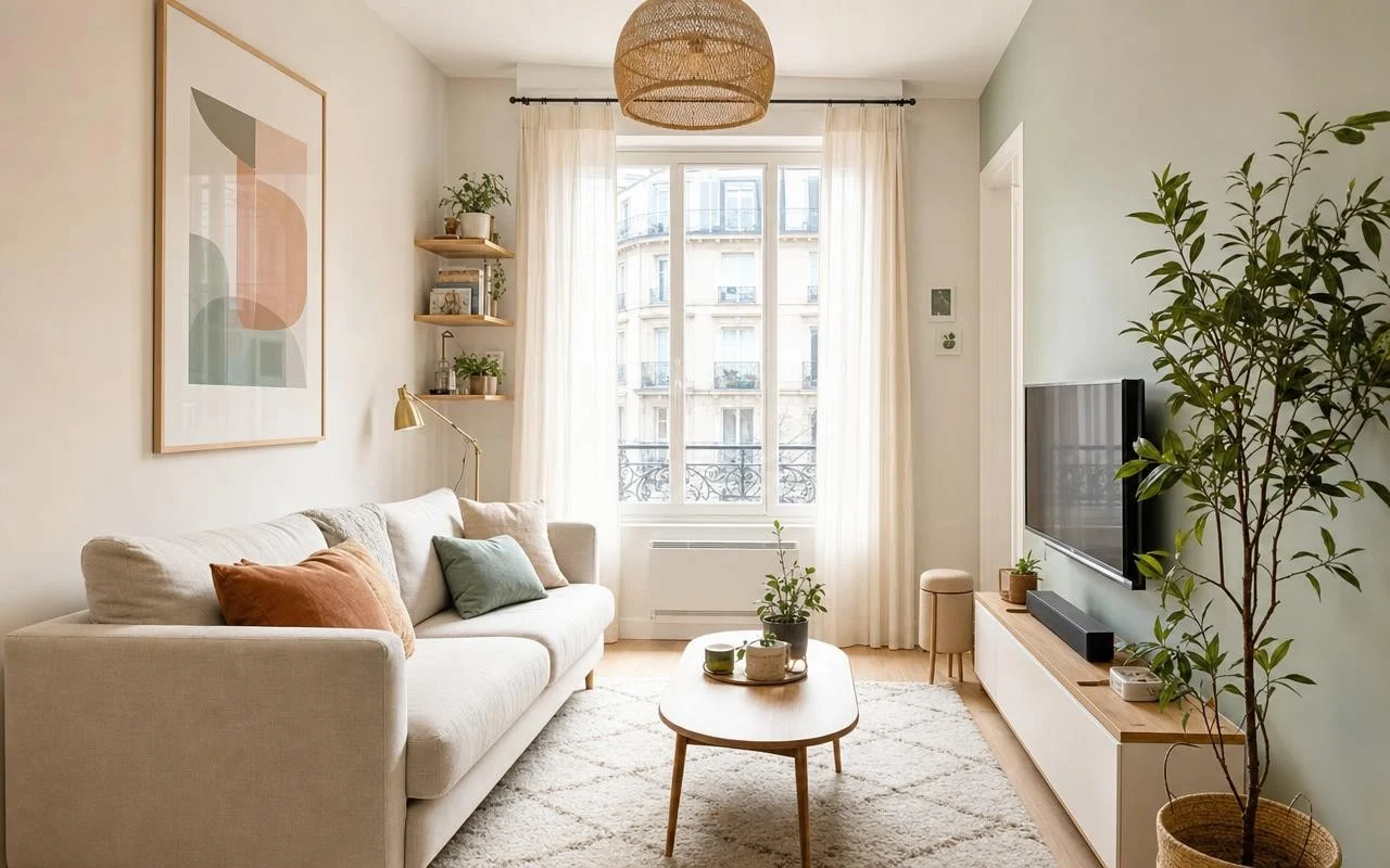
In many apartments, the pattern repeats: you repaint your living room in a deep blue, you love the result in broad daylight, and then in the evening the color shifts to a dreary gray under the LED ceiling light. People blame the paint can, the color chart, their own taste. In reality, between light, finish, and the chosen shade, everything hinges on a very delicate balance.
Good news, even a small living room can feel more spacious without pushing the walls. Interior designers have shared seven paint colors to enlarge a small living room, drawn from lines such as Benjamin Moore, Farrow & Ball, or Portola Paints. Their common denominator: when used with the right lighting and a few pro tricks, they erase the visual boundaries of the room. It all starts well before you open the can.
Before color: light and contrasts in a small living room
decorators who work on compact spaces repeat it: to make the room look bigger, you must reduce visual ruptures. Figures like Leroy Merlin advise keeping walls close in tone, painting doors and baseboards almost the same color, and choosing a ceiling that is just a touch lighter. When the room’s limits are less defined, the eye naturally imagines more space.
Lighting changes everything. The Color Rendering Index (CRI) measures the fidelity of colors on a scale from 0 to 100; daylight hits 100, while many LEDs hover around 80. European regulations already require a CRI of at least 80 indoors, but a CRI near 90 better approximates sunlight. Blues and purples, highly sensitive to an incomplete spectrum, can appear muddy or gray even when the paint is perfect.
7 paint colors that make a small living room look more spacious
A deep color does not necessarily overwhelm a small living room. Gray Walker explains that a dark shade applied in a very glossy or lacquered finish “can yield remarkable results,” making the room feel warmer and less cramped; she cites Eggplant by Benjamin Moore. Grey Joyner favors Jester, a rich plum from the same brand, which “makes the space feel rich and intimate” in a well-lit room. For a small apartment, Taniya Nayak chose Anchor, a Portola Paints shade in the Roman Clay finish, and notes that this color “did everything but close the space off,” while bringing out colored accents.
Jeanne Barber describes Farrow & Ball’s Light Blue as “perfect for cozy small spaces where you want to curl up with a book on a rainy day,” this blue alternating between grayish and slightly greenish tones reminiscent of the New England sea. For a dimly lit living room, Grey Joyner cites Benjamin Moore’s Simply White as “her absolute go-to white,” capable of brightening the room. Becky Shea appreciates Light Pewter, a greige from the same brand, which “creates a mood that is both warm and airy, snug and refreshing.” Finally, Linda Hayslett extols Farrow & Ball’s Green Smoke, a medium sage green that “does not make the room look small or cave-like” and even helps it feel larger.
Choosing and testing the paint color for your small living room
To ensure these tones live up to their promise, the method matters. Paint large swatches on several walls and watch them in the morning, afternoon, and evening, with lights on. Also consider the bulbs: choose a CRI code starting with 9 rather than 8 for a far more faithful rendering, especially with deep blues and greens.
In a small living room, avoid harsh contrasts, very dark matte walls, and more than two strong colors. Keep the deep hues on a single well-lit wall and reserve the calm shades for large continuous surfaces.
